BI Analytics
Within your D&A Career, you will find several BI Tools.
Most popular within enterprises are: all of these are paid products
Sometimes, the OSS BI Tools will come into the picture:
- Grafana
- Others like: Metabase, Redash, Superset…
Normally, these tools go plugged in the final stage of the data pipelines: aka gold
flowchart LR
    %% --- Styles ---
    classDef bronze fill:#EFEBE9,stroke:#8D6E63,stroke-width:2px,color:#3E2723;
    classDef silver fill:#ECEFF1,stroke:#78909C,stroke-width:2px,color:#263238;
    classDef gold fill:#FFFDE7,stroke:#FBC02D,stroke-width:2px,color:#F57F17;
    classDef ai fill:#F3E5F5,stroke:#8E24AA,stroke-width:2px,stroke-dasharray: 5 5,color:#4A148C;
    classDef source fill:#fff,stroke:#333,stroke-width:1px;

    %% --- Sources ---
    subgraph Sources [Data Sources]
        direction TB
        Logs[Logs / IoT]:::source
        DB[Databases]:::source
        APIs[External APIs]:::source
    end

    %% --- The Lakehouse (Medallion) ---
    subgraph Lakehouse [The Data Lakehouse]
        direction LR

        %% BRONZE: Raw
        Bronze[("BRONZE
(Raw Ingestion)
As-is Dump")]:::bronze

        %% SILVER: Cleaned
        Silver[("SILVER
(Refined)
Cleaned & Enriched")]:::silver

        %% GOLD: Aggregated
        Gold[("GOLD
(Curated)
Business Aggregates")]:::gold
    end

    %% --- AI Integration ---
    subgraph AI_Lab [AI & Machine Learning]
        direction TB
        Training(Model Training):::ai
        Inference(AI Agents / RAG):::ai
        Predictions(Predictions / Tags):::ai
    end

    %% --- Consumers ---
    BI[BI Dashboards
& Reports]:::source

    %% --- The Flow ---
    Sources --> Bronze
    Bronze -- "ETL / Cleaning" --> Silver
    Silver -- "Aggregation" --> Gold
    Gold --> BI

    %% --- Where AI Plugs In ---

    %% 1. Training happens on Silver (Granular but clean)
    Silver -.->|"Feeds Data"| Training

    %% 2. Inference (Agents) read Gold (Context) or Silver (Features)
    Gold -.->|"Context for RAG"| Inference

    %% 3. The Feedback Loop: Predictions go back into the Lake
    Training --> Predictions
    Inference --> Predictions
    Predictions -.->|"Enrichment"| Silver
    Predictions -.->|"New Insights"| Gold
Depending on your work environment, you could do fully custom BI proposals.
Custom BI Tools
For a PoC on BI Tools, just go for Streamlit: data centered plus its speed of iterations around a good data model is unmatched
 Streamlit PoC Post
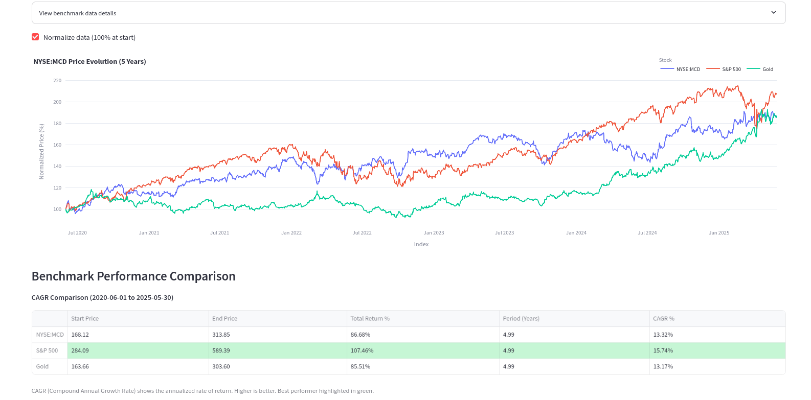 Marketing Docs
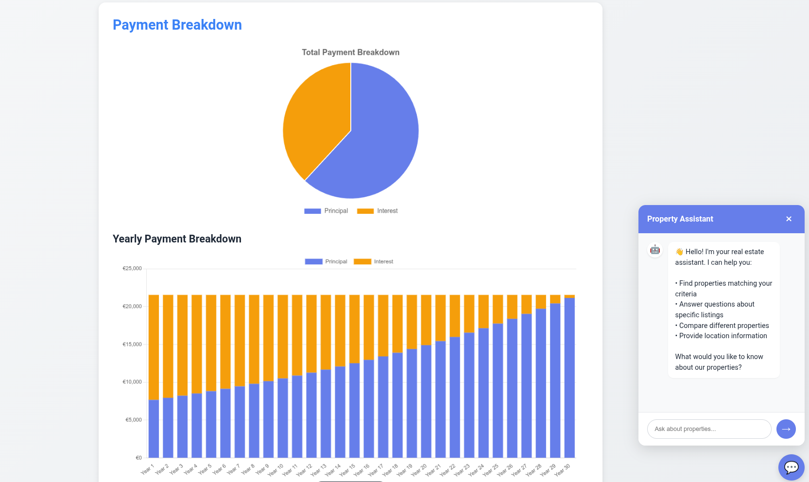
To build a BI Tools even more custom: with certain UI look and feel, you can try Flask
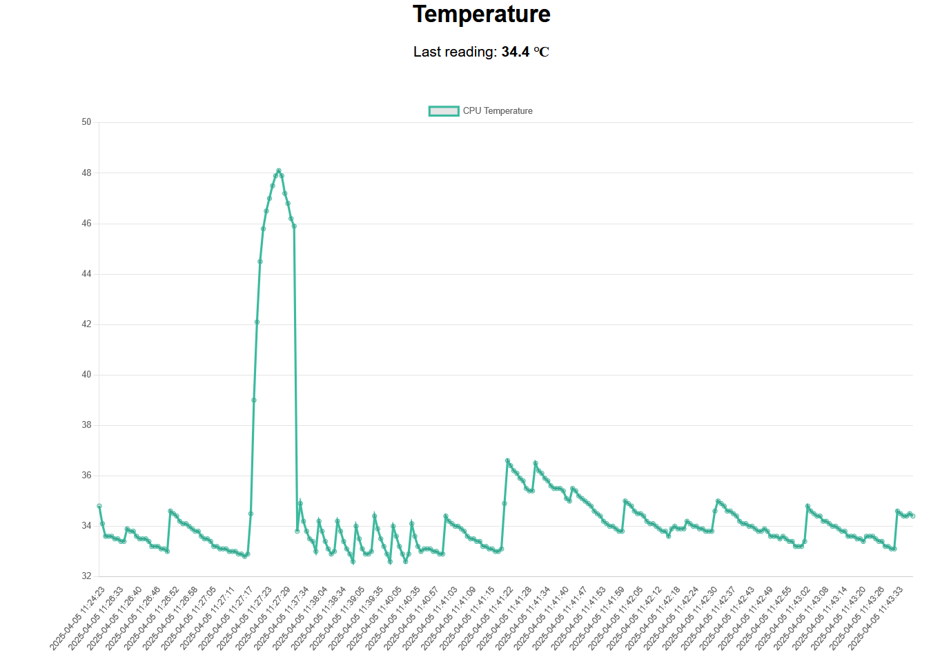 Flask and Real Time Data
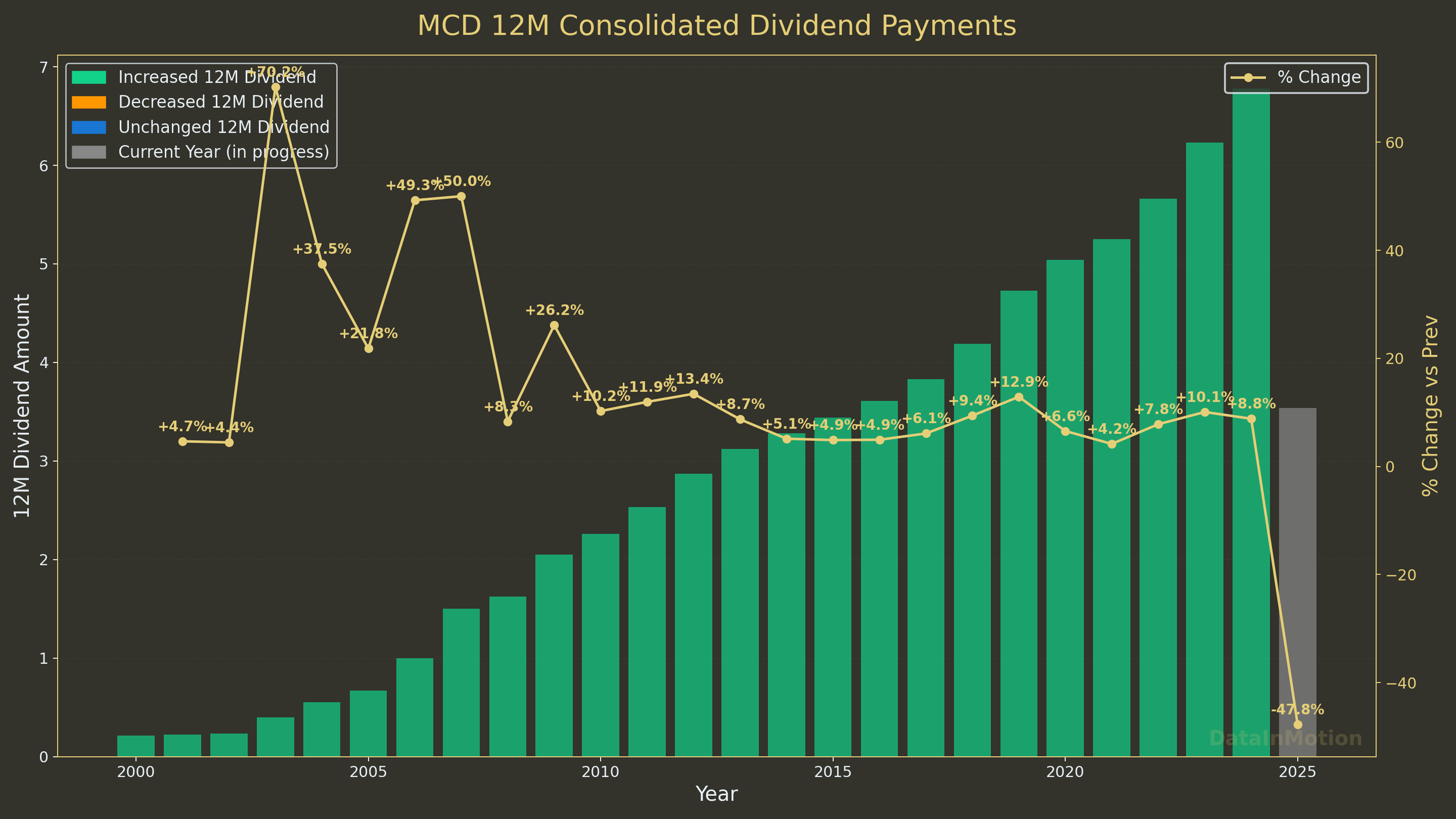 Custom Plots for Reporting
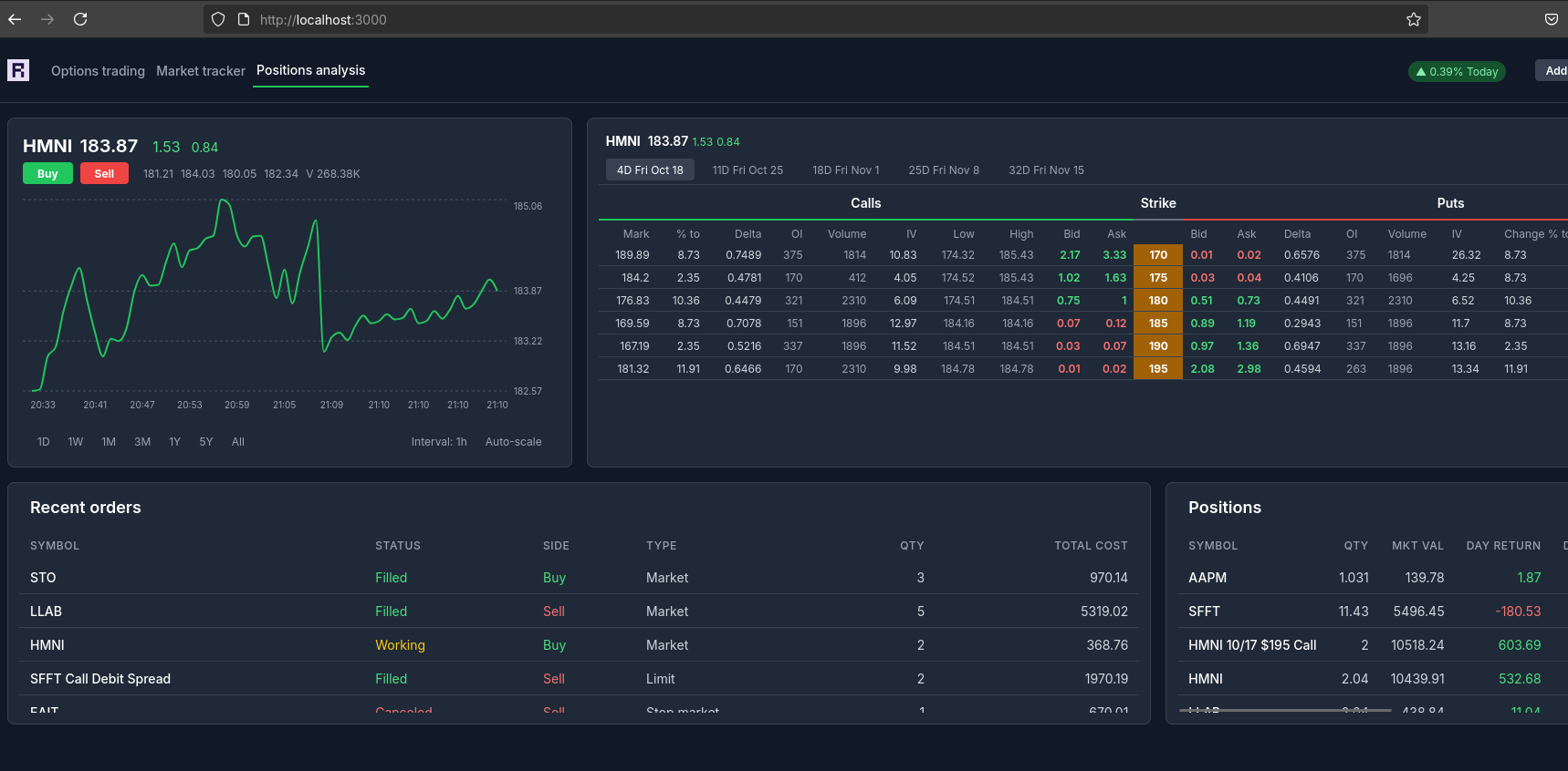
Or for stonks:
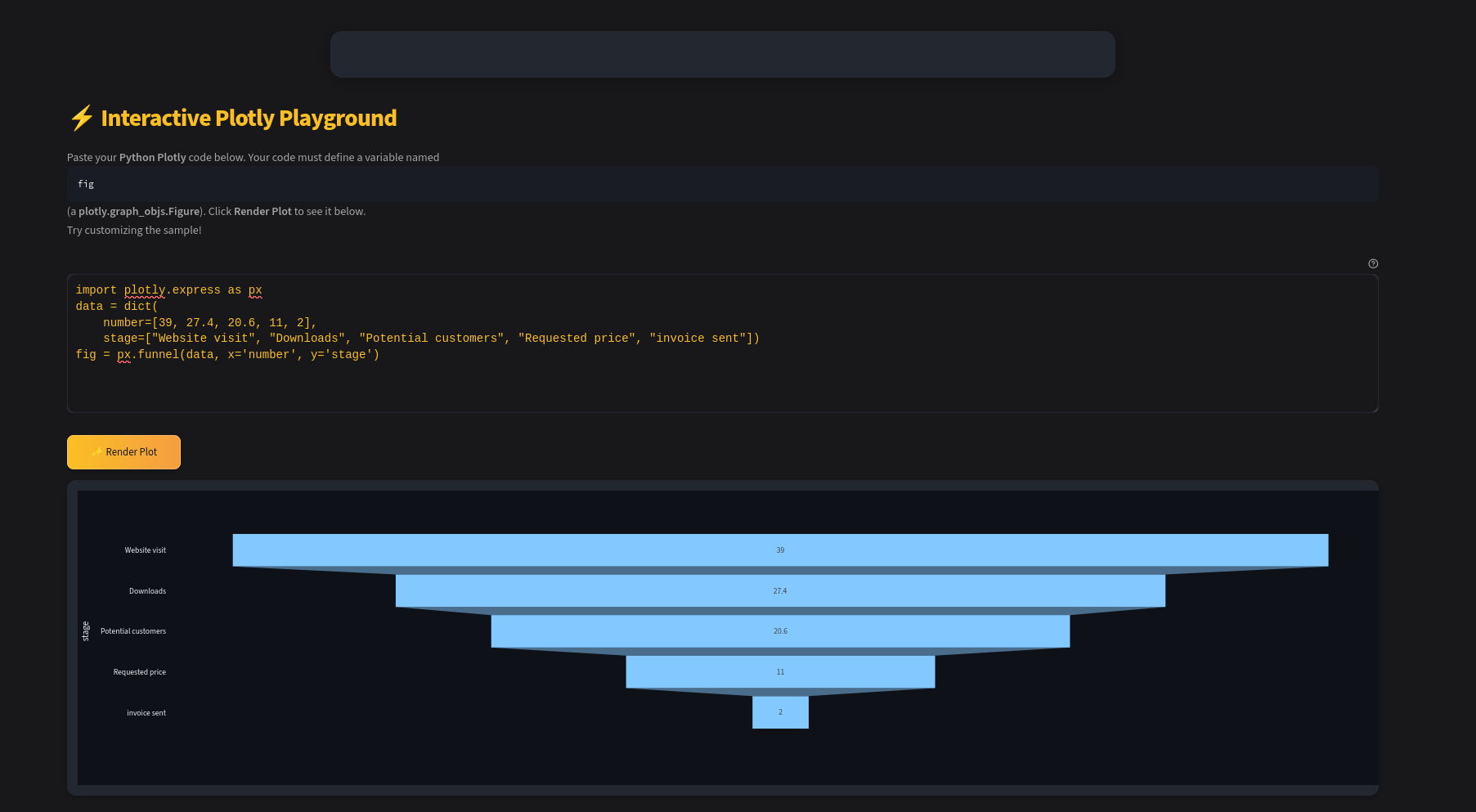
To create interactivity, we have the well known plotly, but also ApexCharts and ChartJS.
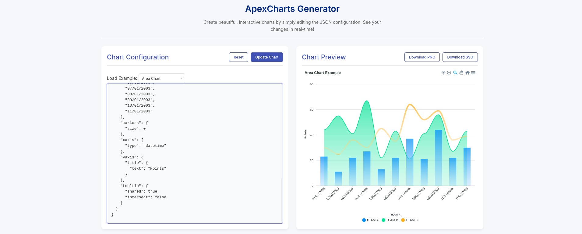
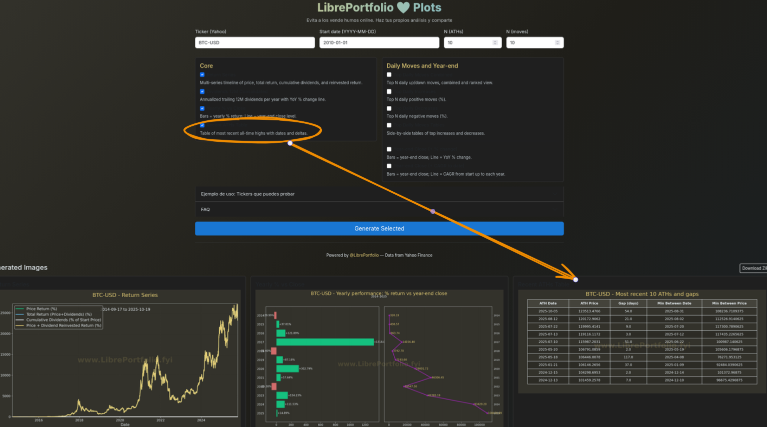
You can also vibe code such CSR’ed dashboards:
Both can be combined and create some cool graphs within SSGs, like in HUGO components and also provide interactivity via CSR.
You can potentially make embedable BI components that work on websites or just get the full power of web apps when designing these.
You could also use these skills when building funnels during your entrepreneurial journey:
PS Reflex has very cool funnels: https://reflex.dev/docs/library/graphing/charts/funnelchart/
You can also create a quick mermaidJS sankey of on boarding flows.